You'll have some or all of these options available to help tailor both the data and insights you include in your report, and the way you present them. You'll need to make sure you working in a custom report in "My Dashboards", and not an Actionable Preset. (Learn about copying Presets here).
Quick Links:
-
Change how your data is grouped (e.g. from Themes to Program Objectives)
For details on how to work with Question Widgets, check out this article instead: How do I use Question Widgets
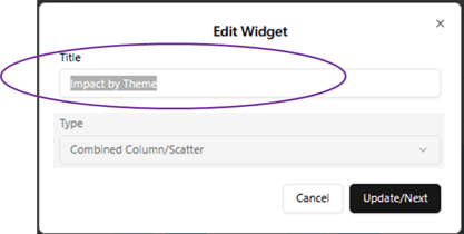
Change or add widget title:
- If you're in a Preset Dashboard, make a copy using the copy option in the top of the Dashboard.
- In your custom copy, navigate to the widget you'd like to edit
- Hover over your widget, then click on the "edit" icon
- You'll see the widget title field. You can replace what's there.
- Click "Update/Next"
- Click "Done."
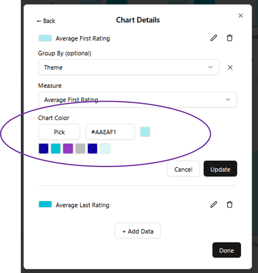
Change chart colors:
- Hover over your widget, then click on the "edit" icon
- Click "Update/Next"
- Select the Measure or Component you'd like to edit (click the edit icon)
- Under "Chart Color" you can:
- click on a square from the palette and it will show as the selected option.
- click "Pick" to select from a general color picker.
- add your own hex code in the field.
- see the selected color in the single square beside the hex code.
- Click "Update" then "Done." (Or select another Component).
Change how your data is grouped:
You have options on how you'd like show your data, to tailor it to your audience. Change from Themes to Program objectives, from Modules to Groups, or organize by Custom Fields you've set up.
- Hover over your widget, then click on the "edit" icon
- Click "Update/Next"
- Select the Data Measure you'd like to edit (click the edit icon)
- Under "Group By" select your preferred grouping for your data. Note: Some group by options will not be appropriate or available for your data. Review your charts to ensure they are showing what you expect.
- Do this for EACH measure in your chart (E.g. If you have Average First Rating and Average Last Rating in your your widget list, you need to adjust the "Group by" option in each one to match).
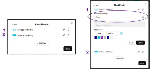
- Click "Update" then "Done."
Change / select your chart type (coming soon!):
- Hover over your widget, then click on the "edit" icon
- You'll see the "Type" field. Scroll through the list of options, and click on the type you'd like to use in your widget.
- Click "Update/Next"
- Click "Done."
Some chart types will not be appropriate for your data. Review your charts to ensure they are showing what you expect.
Change or Add data (Measures) in standard chart widgets (coming soon!):
- Hover over your widget, then click on the "edit" icon
- Click "Update/Next"
- Select the Measure or Component you'd like to edit (click the edit icon)
- Under "Measure" - select from the options:
- Measures are organized by Key Metric areas (Adoption, Engagement, Impact, Totals etc). Scroll to find your metric type, and then the Measures available.
- Some charts need more than one Measure to generate a visualization.
- Click "Update" then "Done." (Or select another Measure).
Note: Some Group by options will not be appropriate or available for your data. Review your charts to ensure they are showing what you expect.
For details on how to make similar changes to Question Widgets, check out this article instead: How do I use Question Widgets